Card
<mo-card> | MOCard
Cards can be used to group related subjects in a container.
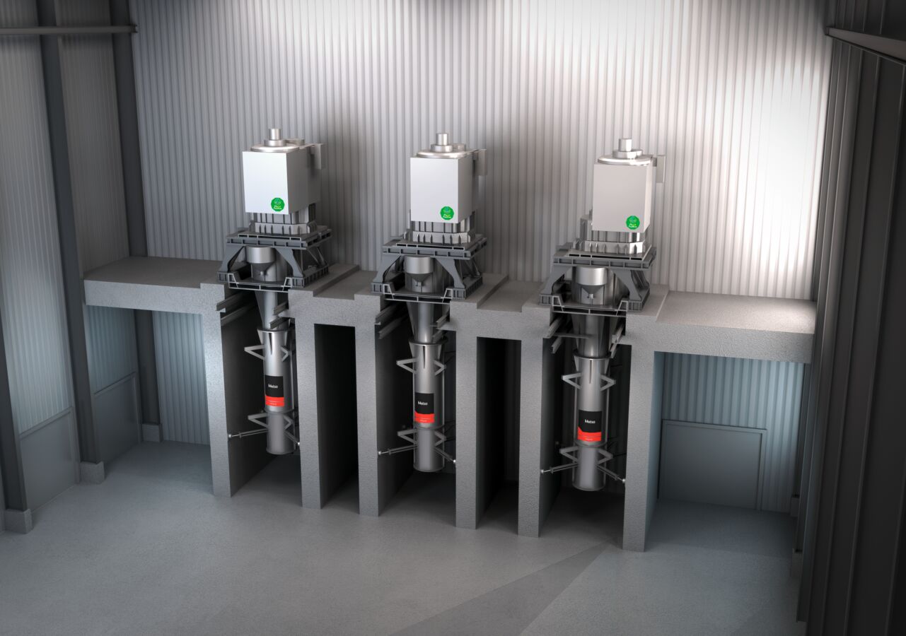
HIG Mills
The Metso HIGmill™ is an advanced, energy-efficient fine and ultra-fine grinding solution that utilizes proven technology.
<mo-card class="card-overview">
  <img slot="image" src="/assets/images/Metso-HIG.jpg" alt="Metso HIG mills." />

  <h4 class="m-0">HIG Mills</h4>
  <p class="m-0">
    The Metso HIGmill™ is an advanced, energy-efficient fine and ultra-fine grinding solution that utilizes proven
    technology.
  </p>

  <div slot="footer">
    <mo-button variant="primary">More Info</mo-button>
    <mo-rating></mo-rating>
  </div>
</mo-card>

<style>
  .card-overview {
    max-width: 300px;
  }

  .card-overview small {
    color: var(--mo-color-neutral-50);
  }

  .card-overview [slot='footer'] {
    display: flex;
    justify-content: space-between;
    align-items: center;
  }

  .m-0 {
    margin: 0 !important;
  }
</style>
import { MOButton, MOCard, MORating } from '@metsooutotec/modes-web-components/dist/react';

const css = `
  .card-overview {
    max-width: 300px;
  }

  .card-overview small {
    color: var(--mo-color-neutral-50);
  }

  .card-overview [slot="footer"] {
    display: flex;
    justify-content: space-between;
    align-items: center;
  }

  .m-0 {
    margin: 0 !important;
  }
`;

const App = () => (
  <>
    <MOCard className="card-overview">
      <img slot="image" src="../assets/images/Metso-HIG.jpg" alt="Metso HIG mills." />
      <h4 class="m-0">HIG Mills</h4>
      <p class="m-0">
        The Metso HIGmill™ is an advanced, energy-efficient fine and ultra-fine grinding solution that utilizes proven
        technology.
      </p>
      <div slot="footer">
        <MOButton variant="primary">More Info</MOButton>
        <MORating></MORating>
      </div>
    </MOCard>

    <style>{css}</style>
  </>
);
Examples
Basic card
Basic cards aren’t very exciting, but they can display any content you want them to.
<mo-card class="card-basic">
  This is just a basic card. No image, no header, and no footer. Just your content.
</mo-card>

<style>
  .card-basic {
    max-width: 300px;
  }
</style>
import { MOCard } from '@metsooutotec/modes-web-components/dist/react';

const css = `
  .card-basic {
    max-width: 300px;
  }
`;

const App = () => (
  <>
    <MOCard className="card-basic">
      This is just a basic card. No image, no header, and no footer. Just your content.
    </MOCard>

    <style>{css}</style>
  </>
);
Card with header
Headers can be used to display titles and more.
<mo-card class="card-header">
  <div slot="header">
    Header Title

    <mo-icon-button name="settings"></mo-icon-button>
  </div>

  This card has a header. You can put all sorts of things in it!
</mo-card>

<style>
  .card-header {
    max-width: 300px;
  }

  .card-header [slot='header'] {
    display: flex;
    align-items: center;
    justify-content: space-between;
  }

  .card-header h3 {
    margin: 0;
  }

  .card-header mo-icon-button {
    font-size: var(--mo-font-size-medium);
  }
</style>
import { MOCard, MOIconButton } from '@metsooutotec/modes-web-components/dist/react';

const css = `
  .card-header {
    max-width: 300px;
  }

  .card-header [slot="header"] {
    display: flex;
    align-items: center;
    justify-content: space-between;
  }

  .card-header h3 {
    margin: 0;
  }

  .card-header mo-icon-button {
    font-size: var(--mo-font-size-medium);
  }
`;

const App = () => (
  <>
    <MOCard className="card-header">
      <div slot="header">
        Header Title
        <MOIconButton name="settings"></MOIconButton>
      </div>
      This card has a header. You can put all sorts of things in it!
    </MOCard>

    <style>{css}</style>
  </>
);
Card with footer
Footers can be used to display actions, summaries, or other relevant content.
<mo-card class="card-footer">
  This card has a footer. You can put all sorts of things in it!

  <div slot="footer">
    <mo-rating></mo-rating>
    <mo-button slot="footer" variant="primary">Preview</mo-button>
  </div>
</mo-card>

<style>
  .card-footer {
    max-width: 300px;
  }

  .card-footer [slot='footer'] {
    display: flex;
    justify-content: space-between;
    align-items: center;
  }
</style>
import { MOButton, MOCard, MORating } from '@metsooutotec/modes-web-components/dist/react';

const css = `
  .card-footer {
    max-width: 300px;
  }

  .card-footer [slot="footer"] {
    display: flex;
    justify-content: space-between;
    align-items: center;
  }
`;

const App = () => (
  <>
    <MOCard className="card-footer">
      This card has a footer. You can put all sorts of things in it!
      <div slot="footer">
        <MORating></MORating>
        <MOButton slot="footer" variant="primary">
          Preview
        </MOButton>
      </div>
    </MOCard>

    <style>{css}</style>
  </>
);
Images
Cards accept an image slot. The image is displayed atop the card and stretches to fit.

AGG Digital offering
Mobile hero image
<mo-card class="card-image">
  <img slot="image" src="../assets/images/AGG-Digital.jpg" alt="A kitten walks towards camera on top of pallet." />
  <h4 class="m-0">AGG Digital offering</h4>
  <p class="m-0">Mobile hero image</p>
</mo-card>

<style>
  .card-image {
    max-width: 300px;
  }
  .m-0 {
    margin: 0 !important;
  }
</style>
import { MOCard } from '@metsooutotec/modes-web-components/dist/react';

const css = `
  .card-image {
    max-width: 300px;
  }
  .m-0 {
    margin: 0 !important;
  }
`;

const App = () => (
  <>
    <MOCard className="card-image">
      <img slot="image" src="../assets/images/AGG-Digital.jpg" alt="A kitten walks towards camera on top of pallet." />
      <h4>AGG Digital offering</h4>
      <p>Mobile hero image</p>
    </MOCard>

    <style>{css}</style>
  </>
);
Elevated cards
Prior to version 3.0,
mo-card used to have a box-shadow behind it by default. If you wish to maintain this elevated
style, just apply a box-shadow css rule to the card itself as shown below.

HIG Mills
The Metso HIGmill™ is an advanced, energy-efficient fine and ultra-fine grinding solution that utilizes proven technology.
<mo-card class="card-elevated">
  <img slot="image" src="../assets/images/Metso-HIG.jpg" alt="Metso HIG mills." />

  <h4 class="m-0">HIG Mills</h4>
  <p class="m-0">
    The Metso HIGmill™ is an advanced, energy-efficient fine and ultra-fine grinding solution that utilizes proven
    technology.
  </p>

  <div slot="footer">
    <mo-button variant="primary">More Info</mo-button>
    <mo-rating></mo-rating>
  </div>
</mo-card>

<style>
  .card-elevated {
    max-width: 300px;
    box-shadow: var(--mo-elevation-1);
  }

  .card-elevated [slot='footer'] {
    display: flex;
    justify-content: space-between;
    align-items: center;
  }

  .m-0 {
    margin: 0 !important;
  }
</style>
import { MOButton, MOCard, MORating } from '@metsooutotec/modes-web-components/dist/react';

const css = `
  .card-elevated {
    max-width: 300px;
  }

  .card-elevated [slot="footer"] {
    display: flex;
    justify-content: space-between;
    align-items: center;
  }

  .m-0 {
    margin: 0 !important;
  }
`;

const App = () => (
  <>
    <MOCard className="card-elevated">
      <img slot="image" src="../assets/images/Metso-HIG.jpg" alt="Metso HIG mills." />
      <h4 class="m-0">HIG Mills</h4>
      <p class="m-0">
        The Metso HIGmill™ is an advanced, energy-efficient fine and ultra-fine grinding solution that utilizes proven
        technology.
      </p>
      <div slot="footer">
        <MOButton variant="primary">More Info</MOButton>
        <MORating></MORating>
      </div>
    </MOCard>

    <style>{css}</style>
  </>
);
Importing
If you’re using the autoloader or the traditional loader, you can ignore this section. Otherwise, feel free to use any of the following snippets to cherry pick this component.
To import this component using a bundler:
import '@metsooutotec/modes-web-components/dist/components/card/card.js';
To import this component as a React component:
import MOCard from '@metsooutotec/modes-web-components/dist/react/card/';
To import this component using a script tag:
<script type="module" src="https://modes-web.metso.com/dist/components/cdn/components/card/card.js"></script>
Slots
| Name | Description |
|---|---|
| (default) | The card’s body. |
header
|
The card’s header. |
footer
|
The card’s footer. |
image
|
The card’s image. |
Learn more about using slots.
Custom Properties
| Name | Description | Default |
|---|---|---|
--border-color |
The card’s border color, including borders that occur inside the card. | |
--border-radius |
The border radius for card edges. | |
--border-width |
The width of card borders. | |
--padding |
The padding to use for card sections.* |
Learn more about customizing CSS custom properties.
Parts
| Name | Description |
|---|---|
base |
The component’s internal wrapper. |
image |
The card’s image, if present. |
header |
The card’s header, if present. |
body |
The card’s body. |
footer |
The card’s footer, if present. |
Learn more about customizing CSS parts.